경영진과 직접 대화해 보세요




경영진
출발하시기 전에, 저희 관리팀이 귀사의 경질 박스 프로젝트를 검토해 드리겠습니다. 제품 유형, 목표 시장 수량, 출시 일정을 알려주시면, 귀사 브랜드에 가장 적합한 구조, 소재, 마감 처리, 최소 주문 수량(MOQ), 생산 계획을 함께 평가해 드리겠습니다.
이것이 바로 냉혹한 현실입니다. 대부분의 화장품은 제품이 그 가치를 증명할 기회조차 얻기 전에 포장만 보고 평가받곤 합니다.
저는 그 과정을 직접 지켜봤습니다. 구매자가 상자를 들어 올리고, 측면을 확인한 뒤, 엄지손가락으로 모서리 포장지를 문지르고, 뚜껑을 반쯤 열어본 다음, 누군가 “유효 성분”, “순한 포뮬러”, “임상 결과”라고 말하기도 전에 결정을 내립니다.”
빠르다. 어쩌면 불공평할지도 모른다. 그래도 현실이다.
보습제는 효과를 입증하는 데 몇 주가 걸릴 수도 있고, 립스틱은 세 번 정도 발라봐야 알 수 있으며, 향수는 피부에 바른 지 20분이 지나면 향이 변할 수도 있습니다. 하지만 제품 포장지는 약 3초, 때로는 그보다 더 짧은 시간만 주목을 받는데, 만약 포장지가 허술해 보이거나 왠지 모르게 평범해 보인다면, 그 안의 제품에 대한 신뢰도는 처음부터 낮아지게 됩니다.
바로 그 때문에 맞춤형 화장품 상자가 중요한 것입니다.
상자가 마법처럼 효능이 떨어지는 제품을 더 좋게 만들어 주기 때문은 아닙니다. 그렇지 않으니까요. 하지만 포장은 제품이 피부에 닿기도 전에 구매자의 기대감을 형성해 주며, 솔직히 말해 뷰티 업계에서 판매의 절반은 바로 그 기대감에 달려 있습니다.
솔직히 말해서, 많은 브랜드들이 용기 모양이나 성분 설명에는 지나치게 집착하면서, 외부 포장 상자는 마치 조달 과정에서 귀찮은 존재처럼 취급한다고 생각합니다. 이는 잘못된 접근입니다. 상자는 첫인상을 결정짓는 요소입니다. 만약 상자가 푹신하거나, 소리가 나거나, 내용물이 흔들리거나, 시각적으로 인상 깊지 않다면, 그 브랜드는 이미 어느 정도 입지를 잃은 셈입니다.
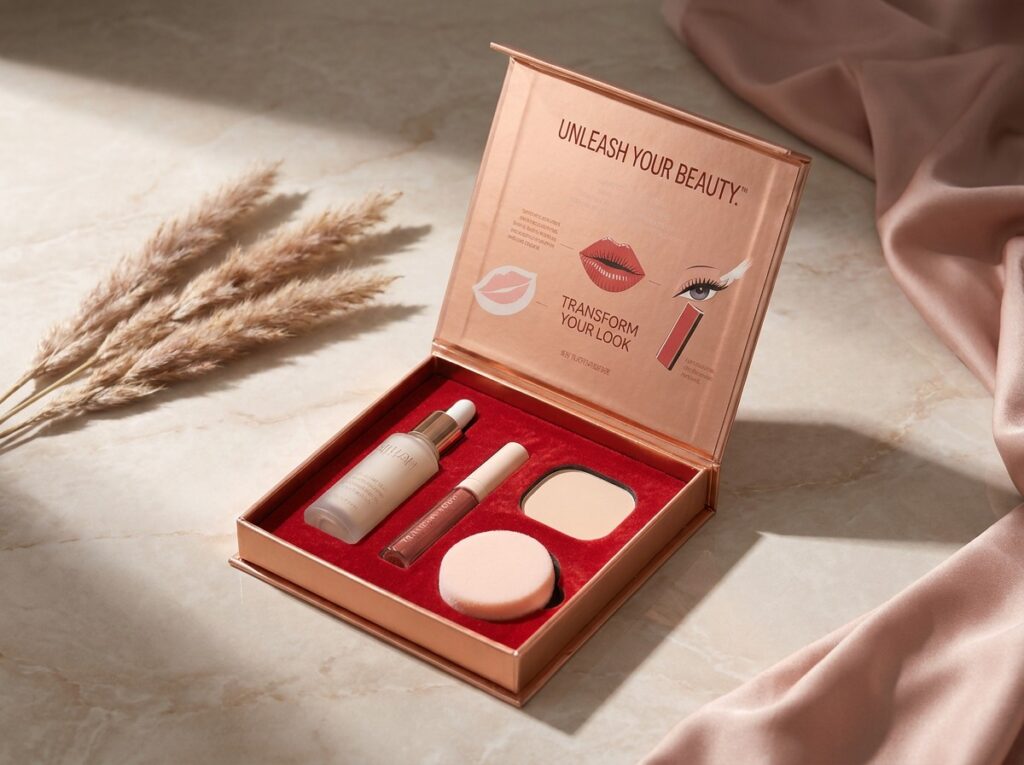
하지만 “딱딱한” 것과 “고급스러운” 것을 혼동하지 마세요. 제발요.
일부 견고한 세트업 박스는 정말 멋집니다. 반면, 그저 엉망진창인 제품들도 있죠. 두꺼운 그레이보드에 포장 장력이 제대로 잡히지 않았고, 접착선이 엉성하며, 자석의 흡착력이 약하고, 호일 마감은 실제 생산 샘플이라기보다 화면 상의 모형만 보고 승인한 것처럼 보이는 제품들 말이에요. 그런 건 정말 많이 봐왔습니다.
그런 일은 생기기 마련이에요. 자주요.
훌륭한 맞춤형 화장품 경질 상자는 제품 노출을 적절히 조절하기 때문에 효과적입니다. 상자 본체가 납작하게 찌그러지지 않고, 뚜껑을 열 때 적당한 저항감이 느껴집니다. 내부 삽입물은 용기나 병을 단단히 고정해 주어 값싼 느낌이 드는 덜거덕거리는 소리가 나지 않습니다. 로고는 손, 눈, 카메라가 기대하는 위치에 정확히 배치되어 있습니다. 전체적으로 세심하게 디자인된 느낌을 주며, 그 주에 유행하던 마감 트렌드를 무작정 따라 조립한 듯한 인상을 주지 않습니다.
그것이 바로 브랜드 기억이 만들어지는 과정입니다.
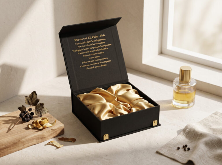
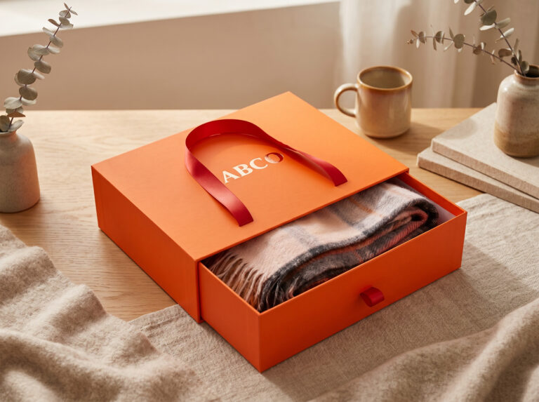
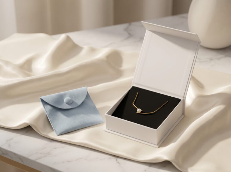
A 하트 모양 잠금 장치가 달린 뚜껑이 있는 고급 더블 도어 단단한 선물 상자 단순히 열기만 하는 것이 아닙니다. 제품을 돋보이게 연출합니다. A 메탈릭 자성 웰니스 경질 포장 상자 클로저의 감성과 반사광을 브랜드 코드의 일부로 활용합니다. A 폼 삽입재가 들어 있는 검은색 투명 경질 포장 상자 이는 고객에게 투명성을 제공함과 동시에 안심감을 줍니다.
그것이 “럭셔리 경험’을 미사여구로 포장한 또 다른 문단보다 훨씬 더 중요합니다.
그리고 분명히 해두자면, 저는 대외적으로 공개되는 링크를 wp-admin 라이브 블로그 게시물 내의 URL을 수정할 수 있습니다. 비록 해당 URL이 내부 링크 목록에 포함되어 있더라도 말이죠. 이는 백엔드 편집용 링크일 뿐, 사용자가 안전하게 이용할 수 있는 탐색 링크가 아닙니다. 이러한 링크는 기사 본문이 아닌 워드프레스 작업 흐름에서 사용하도록 하세요: 내부 관리용 초안 링크 697 내부 관리용 초안 링크 715
아무도 여러분의 다이라인에 있는 모든 패널을 다 기억하지는 않습니다.
그들은 세부적인 부분들을 기억합니다. 로고가 배치된 위치. 부드러운 질감의 검은색 상자. 서랍 손잡이. 작은 자석 잠금장치. 세럼 병이 창고에서 난투극을 겪은 듯 흔들거리지 않고, 삽입대에 딱 맞게 자리 잡는 모습까지.
바로 이 지점에서 브랜드 화장품 포장 상자는 그 가치를 입증하거나, 아니면 브랜드 팀의 안일함을 드러내게 됩니다.
| 인식 드라이버 | 고객이 눈치채는 점 | 브랜드가 얻는 이점 | 흔히 저지르는 실수 |
|---|---|---|---|
| 로고 배치 | 모든 상자 면에 동일한 마크 위치 | 소매, 소셜 비디오 및 언박싱 영상에서 더 빠른 재생 속도 | 호일 반사광 아래에 숨겨진 작은 로고 |
| 판 두께 | 무겁고 안정적인 그립감 | 제품 사용 전의 지각된 가치 상승 | 두께가 두꺼운 판재이며, 랩핑 품질이 좋지 않음 |
| 색상 체계 | 반복 가능한 팬톤 또는 CMYK 계열 | 더 강력한 진열대 점유율과 브랜드 인지도 | 브랜드 논리와는 무관하게 트렌디한 색상을 활용하기 |
| 디자인 삽입 | 제품이 딱 맞게 장착되며, 덜거덕거리는 소리가 나지 않습니다. | 신뢰, 보호, 더욱 선명한 드러냄 | 제품의 형태를 잡아주는 저렴한 인서트 |
| 개회 동의안 | 리프트오프형, 자석식, 서랍형, 양문형 | 구매자들이 해당 브랜드와 연관 짓는, 반복적으로 행해지는 의식 | 사용자를 짜증 나게 하는 과도하게 복잡한 상자 |
| 주장 및 표기 | 지속 가능성, 자재 및 폐기 관련 문구를 명확히 함 | 신뢰 및 규정 준수 위험 감소 | 모호한 “친환경” 표현 |
그 표는 단순해 보이지만, 사실 그렇지 않습니다.
모든 행이 생산에 영향을 미치기 때문입니다. 로고 배치에 따라 호일 스탬핑과 아트워크 트랩에 영향을 미칩니다. 판지 두께는 운송비, 모서리 찌그러짐, 포장 상태, 진열 시 느낌에 영향을 줍니다. 삽입재 선택에 따라 조립 속도, 낙하 충격 방지 성능, 재활용 가능성, 그리고 뚜껑을 열었을 때 제품이 싸 보이게 될지 여부가 결정됩니다.
브랜드들이 듣기 싫어하는 말이 바로 이것입니다. “예쁘게 만들어 주세요”라는 말은 유용한 패키징 기획 지침이 아닙니다.
유용한 사양서에는 다음과 같이 명시되어 있습니다: 1200 gsm 그레이보드, 포장지, 팬톤(Pantone) 기준에 따른 브랜드 색상, 뚜껑에 블라인드 엠보싱, 주요 로고에만 호일 처리, 지속 가능성 포지셔닝에 따라 EVA 또는 성형 펄프 인서트 사용, 모든 SKU에 걸쳐 로고 배치 위치 고정, 불리한 소매점 조명 조건에서 샘플 테스트 완료.
보기 흉한 매장 조명은 중요합니다.
스튜디오 렌더링은 거짓말을 한다.
하지만 화장품 포장에는 그 중심에 모순이 자리 잡고 있다.
고객들은 여전히 무게감을 좋아합니다. 선물 같은 느낌을 좋아하죠. “네, 멋진 물건을 샀어요”라고 말해 주는 듯한 단단한 상자를 선호합니다. 하지만 동시에 낭비에 대한 거부감도 점점 더 커지고 있습니다. 지나치게 큰 빈 공간, 플라스틱 트레이, 불필요한 슬리브, 열 겹이나 되는 티슈, 그리고 마치 법무팀을 피해 숨어 있는 위원회가 작성한 듯한 지속 가능성 주장 등이 바로 그 예입니다.
예전의 럭셔리 전략은 간단했다. 소재를 더 많이 쓰고, 광택을 더하고, 크기를 더 크게 만드는 것이었다.
그건 점점 위험해지고 있네요.
에 따르면 NIQ의 2023년 지속가능한 뷰티 분석, 응답자의 62%는 지속가능성이 2년 전보다 더 중요해졌다고 답했다. 또 다른 NIQ 지속가능한 포장 보고서 조사 대상 쇼핑객 중 92%는 브랜드를 선택할 때 지속 가능성을 중요하게 생각한다고 답했다.
대부분의 소비자들은 PCR과 PIR 함량의 차이를 알고 있을까요? 아닙니다.
하지만 소비자들은 포장이 지나치게 낭비적으로 느껴질 때를 잘 알고 있습니다. 브랜드가 앞면에 “클린 뷰티”를 내세우고 있으면서도, 작은 화장품 용기가 플라스틱 트레이와 광택 라미네이션이 입혀진 거대한 단단한 상자에 담겨 배송될 때를 소비자들은 눈치챕니다.
그 틈새에서 악취가 나네요.
그리고 규제 당국은 표현을 면밀히 주시하고 있다. 그 FTC 그린 가이드 이는 브랜드가 증거 없이 모호한 표현을 사용할 경우, 환경 마케팅 주장이 소비자를 오도할 수 있기 때문입니다. “친환경”, “그린”, “재활용 가능”, “생분해성” 등. 이 단어들은 무해한 단순한 형용사가 아닙니다. 이에 대한 입증 자료가 필요합니다.
유럽은 더욱 인내심이 없다. 로이터는 2024년 3월에 보도했다 지난 10년 동안 EU의 포장 폐기물이 20% 이상 증가했으며, 유럽인들은 1인당 매년 약 190kg의 포장 폐기물을 발생시키고 있는 것으로 나타났다. 같은 보고서는 2030년까지 5%, 2040년까지 15% 감축 목표를 제시했으며, 2030년까지 모든 포장재를 재활용 가능하게 만들겠다는 방침도 밝혔다.
그러니까 럭셔리 화장품 포장에도 여전히 ‘욕망’이 필요한 거군요. 알겠습니다.
하지만 이제는 실질적인 논리와 규정 준수 체계, 그리고 조달 담당자가 관련 서류를 요청하는 순간 무너지지 않는 지속 가능성 전략도 필요합니다.
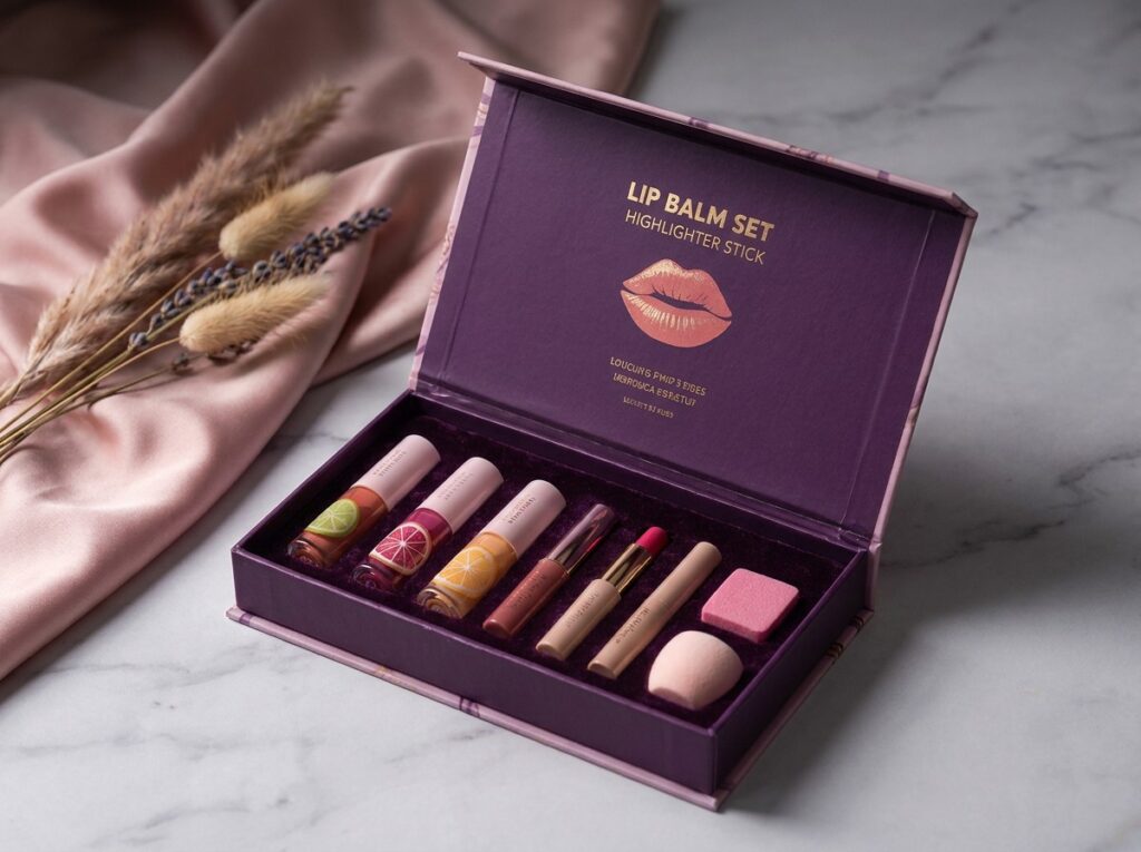
“로고를 좀 더 크게 만들 수 있을까요?”
그 말을 듣자마자 금세 지쳐버려요.
로고 크기가 중요하지 않아서가 아닙니다. 물론 중요합니다. 하지만 대비가 약하거나, 위계 구조가 불분명하거나, 호일 선택이 부적절하거나, 시인성이 낮은 위치에 배치되었거나, PDF에서는 괜찮아 보이지만 라미네이션 후 질감이 있는 종이 위에서는 제대로 표현되지 않는 디자인의 경우, 단순히 크기를 키우는 것은 종종 잘못된 해결책입니다.
2024년에 발표된 한 논문에서 로고 탐지 및 두드러짐 맵 예측을 활용한 포장재 내 브랜드 가시성 YOLOv8, 로고 탐지 데이터셋, 시각적 주의 모델링을 활용하여 로고가 포장재에서 어떻게 시선을 사로잡는지 연구했습니다. 좀 괴짜 같나요? 네. 유용할까요? 아주 유용합니다.
바로 이 지점에서 로고가 들어간 화장품 상자는 더 이상 “이거 눈에 띄는 것 같은데”라는 식의 막연한 판단에 의존할 필요가 없어지기 때문입니다.”
옅은 베이지색 종이 위에서 샴페인색 호일 로고가 보이지 않는다면, 그것은 절제미가 아니라 대비가 낮은 것입니다. 전자상거래 썸네일에서 전면 패널의 로고가 잘려 나온다면, 그것은 세련된 여백 구성이 아니라 디지털 진열대에 대한 잘못된 사고방식입니다. 상자가 완벽한 스튜디오 조명 아래에서 촬영되었을 때만 로고가 제대로 보인다면, 그 로고는 제대로 작동하지 않는 것입니다.
제 경험에 비추어 볼 때, 로고의 가시성을 높이기 위해서는 네 가지 실용적인 영역이 필요합니다.
가장 먼저 눈에 띄는 패널은 바로 이것입니다: 소매점 진열대, 웹사이트 썸네일, 영업 프레젠테이션 자료, 유통업체 카탈로그, 아마존 스타일의 상품 목록 이미지 등입니다. 로고, 제품명, 성분 정보, 색상 체계가 한눈에 잘 파악되어야 합니다.
사냥 금지.
상자를 열었을 때, 내부 뚜껑, 삽입물, 트레이, 티슈, 리본 또는 인쇄된 안감에는 브랜드 코드가 반복해서 표시되어야 합니다. 누군가가 내부가 “텅 비어 보인다”고 느낀다는 이유만으로 그 공간을 무분별한 장식으로 낭비해서는 안 됩니다.”
‘비어 있음’은 사치일 수 있다.
‘랜덤’은 대개 그렇지 않다.
틱톡과 인스타그램은 여러분의 완벽한 결과물 따위는 신경 쓰지 않습니다. 이 플랫폼들은 흔들리는 손, 이상한 조명, 세로로 잘린 화면, 어수선한 카운터, 그리고 빠른 컷을 그대로 보여줍니다. 로고와 구조가 그런 환경에서도 살아남지 못한다면, 그 디자인은 겉보기보다 훨씬 취약한 것입니다.
단단한 화장품 상자는 종종 오랫동안 남아 있게 마련입니다. 향수 세트. 스킨케어 키트. 홀리데이 한정판. 홍보용 패키지. 한정판.
보관된 상자는 비용 없이 활용되는 브랜드 홍보 수단이 됩니다. 사소한 일일까요? 그럴 수도 있겠죠. 하지만 반복적인 노출을 통해 기억이 형성되는 법입니다.
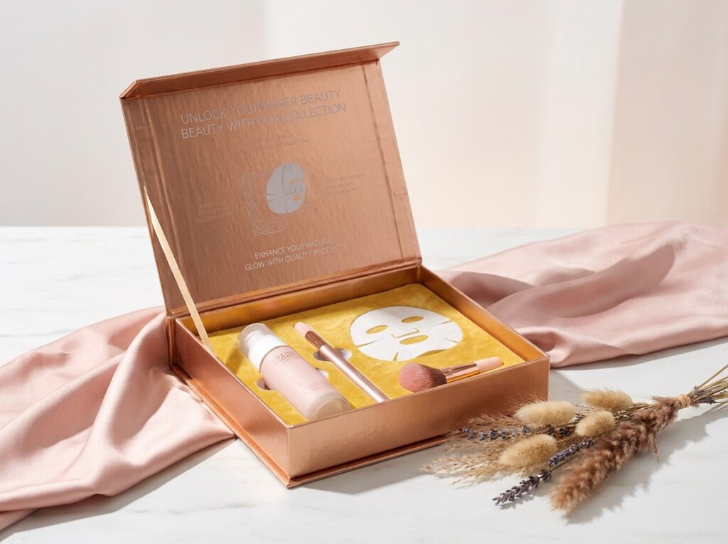
하지만 진정한 브랜드의 신호는 대개 촉각적인 경우가 많습니다.
경쟁사는 여러분의 색상 팔레트를 스크린샷으로 캡처할 수 있습니다. 레이아웃을 모방할 수도 있고, 전체적인 분위기를 따라 할 수도 있습니다. 하지만 상자의 정확한 ‘손에 닿는 느낌’—판지의 밀도, 포장지의 질감, 닫을 때의 저항감, 내부 삽입물의 밀착도, 뚜껑의 마찰감, 모서리 마감 처리, 그리고 상자를 열 때 나는 소리—은 쉽게 모방할 수 없습니다.
바로 그 지점에서 경질 포장재가 주목받기 시작합니다.
상자는 겉보기에는 비싸 보이지만 실제로는 싸구려처럼 느껴질 수 있습니다. 이런 일은 흔히 있습니다. 두꺼운 판지에 포장만 대충 되어 있거나, 지문이 잘 묻는 소프트 터치 필름이 사용되기도 합니다. 서랍식 상자의 손잡이는 뻑뻑하고, 자석식 뚜껑은 잠금력이 약합니다. 폼 삽입물이 너무 꽉 끼어 있어, 고객은 마치 단단한 케이스에서 공구를 꺼내듯이 병을 힘겹게 꺼내야만 합니다.
사치스러운 건 아니에요. 그냥 짜증 날 뿐이에요.
그리고 짜증 나는 일도 기억에 남습니다.
공급업체의 샘플 보드가 터져 나온 것처럼, 한 상자에 호일, 엠보싱, 디보싱, 스팟 UV, 리본, 메탈릭 종이, 소프트 터치 라미네이션 등을 마구 쏟아붓기보다는, 브랜드가 한두 가지 마감 기법을 제대로 활용하는 모습을 보는 편이 낫습니다.
절제미가 판매를 이끈다.
관용도 마찬가지입니다.
화장품용 경질 세트업 박스의 경우, 사소한 제작 세부 사항들이 바로 브랜드의 정체성을 결정짓는 요소가 됩니다. 접착제 크리프, 그레이보드 두께, 종이의 결 방향, 모서리 갈라짐, 포장지 정렬 상태, 삽입물 압축 정도, 자석의 인장력, 그리고 해상 운송 중 습기의 영향을 받은 후에도 뚜껑이 여전히 깔끔하게 닫히는지 여부 등이 바로 그것입니다.
포장 분야에서 오랫동안 일해 온 구매 담당자들이 눈여겨보는 부분이 바로 그런 것들입니다.
일부 브랜드는 인서트를 쓸모없는 공간으로 취급합니다.
틀렸어요.
인서트가 바로 무대입니다. 인서트는 제품의 각도, 파손 위험, 노출 품질, 포장 속도, 그리고 뚜껑을 열었을 때 제품이 주는 고급스러운 느낌을 모두 좌우합니다. EVA 폼, 성형 펄프, 판지 칸막이, PET 트레이, 플록 처리된 블리스터, 실크 안감이 들어간 홈 등—소재가 다르면 전달되는 느낌도 달라집니다.
EVA는 정밀성과 보호 기능을 상징합니다. 성형 펄프는 플라스틱 사용량을 줄이고 자연스러운 느낌을 줍니다. 판지 칸막이는 적절히 설계된다면 비용 효율적이고 재활용이 가능하다는 장점을 갖습니다. PET 트레이는 내용물의 가시성과 고정력을 보장하지만, 지속 가능성 측면에서는 다소 부정적인 인상을 줄 수 있습니다. 플록 처리된 삽입물은 제품 카테고리에 따라 고급스러워 보일 수도 있고, 구식처럼 보일 수도 있습니다.
마법 같은 삽입물은 없습니다.
“아마도 그럴 것이다”라고 말하는 사람은 대개 특정 재료를 팔고 있는 사람이며, 당신이 더 이상 질문하지 않기를 바라는 사람입니다.
맞춤형 화장품 경질 상자의 경우, 저는 제품의 무게, 용기 모양, 파손 취약성, 폐기 처리 방식, 조립 속도, 브랜드 포지셔닝 등을 종합적으로 고려하여 삽입재를 선택하겠습니다. 단순히 단가만 따지는 것은 아닙니다. $60 스킨케어 세트 안에 품질이 좋지 않은 삽입재를 넣어 몇 센트나 절약한다고 해서 진정한 비용 절감이라고 할 수는 없습니다.
그건 헛된 절약일 뿐입니다.
구매자는 먼저 살펴보고, 생각은 그 다음에 한다.
매장 진열대에서는 박스가 시각적으로 눈에 띄어야 합니다. 온라인에서는 썸네일 압축을 거친 후에도 잘 보여야 합니다. 유통업체 카탈로그에서는 단순히 예쁜 박스들이 무작위로 모인 것이 아니라, 하나의 브랜드 시스템처럼 보여야 합니다.
같은 뷰티 라인의 SKU 세 가지가 마치 사촌처럼 닮아 있다면, 그건 좋은 일입니다. 낯선 사람처럼 보인다면, 시스템에 문제가 있는 것입니다.
시작 순간이 바로 카피의 성패가 결정되는 순간입니다.
상자에 ‘프리미엄’이라고 적혀 있어도 뚜껑이 흔들리고, 내부 삽입물이 덜거덕거리고, 호일 인쇄가 어긋나 있으며, 제품이 비뚤게 놓여 있다면, 고객은 포장학 학위가 필요하지 않습니다. 그녀의 손이 이미 알아차리기 때문입니다.
게다가 손은 속이기 어렵습니다.
사람들은 튼튼한 상자를 잘 보관해 둡니다.
메이크업 도구. 보석류. 샘플. 영수증. 이것저것 케이블. 여행용 미니 제품. 뭐든 들어갈 수 있죠.
그 두 번째 삶이 중요한 이유는 브랜드가 계속 눈에 띄기 때문입니다. 접이식 골판지 상자는 대개 금방 재활용됩니다. 반면 단단한 화장품 상자는 몇 달 동안 선반 위에 놓여 있으면서, 로고와 색상 코드를 조용히 반복해 보여줍니다.
그것이 바로 판매 후의 브랜드 인지도입니다.
이제 뷰티 제품의 패키지가 세로형 영상 속에 담겨 있습니다.
조명이 형편없다. 컷이 너무 빠르다. 화면이 잘렸다. 로고의 절반을 가리는 손. 헤어브러시와 아이스 커피 옆에 놓인 욕실 세면대 위에서 상자가 열린다. 그게야말로 진정한 시험이다.
높은 명암비는 살아남는다. 깔끔한 기하학적 형태는 살아남는다. 절제된 포일 효과는 살아남는다. 지나치게 섬세한 디자인은 종종 사라진다.
죄송하지만, 사실입니다.
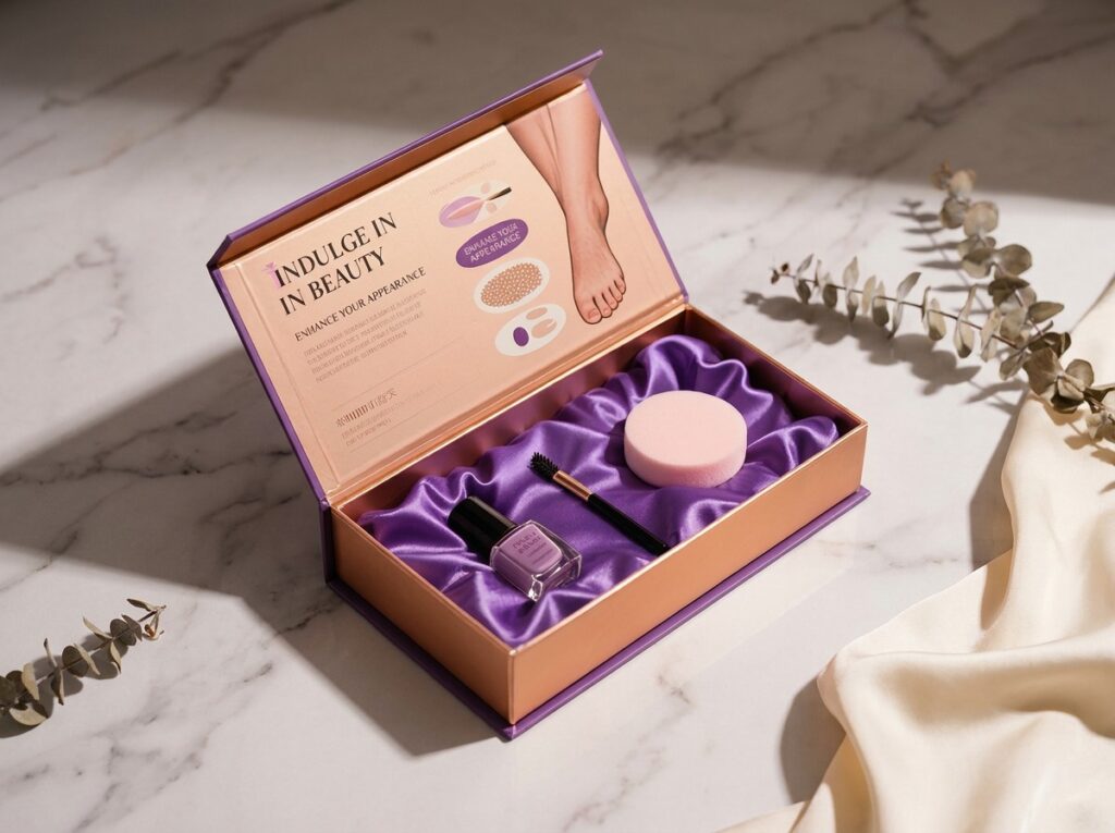
그러니 제가 공급업체에 브리핑을 한다면, “우리는 고급스러운 포장을 원합니다.”라고 말하지는 않을 겁니다.”
첫 만남에서부터는 그 표현을 쓰지 않도록 할 거예요.
제 생각에는: gsm과 두께별로 다양한 보드 옵션을 보여주세요. 랩지 선택지도 보여주세요. 단순한 깨끗한 샘플 시트가 아니라 실제 용지에 적용된 호일 스탬핑을 보여주세요. 삽입물 허용 오차를 보여주세요. 자석의 흡착력을 보여주세요. 취급 후 모서리 상태를 보여주세요. 매장의 따뜻한 조명 아래에서도 로고가 잘 보이는지 보여주세요. 습기에 노출된 후 상자의 상태를 보여주세요. 포장 라인에서 포장지를 손상시키지 않고 얼마나 빠르게 조립할 수 있는지 보여주세요.
그러면 미학에 대해 이야기해 볼 수 있겠네요.
황금 샘플은 주문이 아니기 때문입니다. 황금 샘플은 약속입니다. 대량 생산 단계에서 그 약속이 지켜지느냐 무너지느냐가 결정됩니다.
5,000개 규모에서는 사소한 결함도 성가신 문제가 됩니다. 50,000개 규모에서는 비용이 많이 드는 문제가 되고, 500,000개 규모에서는 브랜드 이미지에 타격을 주는 문제가 됩니다.
그렇기 때문에 본격적인 화장품 포장 디자인은 첫 발주서가 체결되기 전에 디자인, 엔지니어링, 조달, 지속가능성, 품질 관리(QC)를 유기적으로 연계해야 합니다.
그 뒤로는 아니에요.
맞춤형 화장품 경질 상자는 고객이 제품을 보고, 개봉하고, 보관하고, 사진으로 찍거나 재구매할 때마다 로고 위치, 색상 팔레트, 판지 두께, 내부 삽입물의 맞춤 정도, 개봉 방식, 마감 품질 등 동일한 시각적·물리적 요소를 반복함으로써 브랜드 인지도를 높입니다. 이러한 반복을 통해 포장은 브랜드에 대한 기억으로 자리 잡게 됩니다.
진정한 비결은 일관성에 있습니다. 아름답게 디자인된 상자 하나만으로는 한 번의 인상을 남길 수 있지만, 체계적인 포장 시스템을 통해 고객들은 스킨케어 용기, 향수 세트, 메이크업 키트, 홍보용 박스, 시즌 한정 상품, 매장 진열대 등 다양한 제품에서 브랜드를 인식하도록 익숙해집니다.
제품의 진열 효과를 높이고, 고급스러운 이미지를 강조하며, 보호 기능을 강화하거나, 더욱 기억에 남는 개봉 경험을 제공해야 할 경우, 맞춤형 화장품 상자가 표준 화장품 상자보다 더 적합합니다. 특히 유리 용기, 향수병, 홍보용 키트, 럭셔리 세트, 프리미엄 화장품 신제품 출시 시에는 경질 상자가 유용합니다.
그렇다고 해서 접이식 골판지 상자가 “나쁘다’는 뜻은 아닙니다. 이 상자는 더 가볍고, 저렴하며, 포장 속도가 빠를 뿐만 아니라 대량 판매되는 SKU의 경우 종종 더 현명한 선택이 되기도 합니다. 실수는 프리미엄급 품질을 약속하면서 저렴한 구조의 상자를 사용하거나, 마진이 이를 감당할 수 없는 상황에서 과도하게 튼튼한 경질 상자를 사용하는 데 있습니다.
고급 화장품 패키징은 구조, 소재, 인쇄 마감, 내부 구성품의 조화, 개봉 동작 등이 서로 주목을 끌기 위해 경쟁하기보다는 하나의 명확한 브랜드 정체성을 뒷받침할 때 비로소 진정한 고급스러움을 드러냅니다. 두꺼운 판지 자체만으로는 고급스러운 가치를 창출할 수 없으며, 명확한 위계 구조, 정교한 마감, 절제된 색상, 그리고 만족스러운 개봉 경험이야말로 그 가치를 만들어냅니다.
호일 스탬핑이 도움이 될 수 있습니다. 엠보싱, 디보싱, 질감이 있는 종이, 자석 잠금장치, 리본 손잡이, 맞춤형 트레이 등도 마찬가지입니다. 하지만 마감 처리가 너무 많으면 상자가 어수선해 보일 수 있습니다. 진정한 고급스러움은 대개 절제미에서 비롯됩니다.
로고가 인쇄된 화장품 상자의 경우, 브랜드가 구체적인 소재 데이터, 공급업체 문서, 재활용 지침, FSC 기록, PCR 함량 명세서 또는 기타 신뢰할 수 있는 근거 자료를 통해 이를 입증할 수 있는 경우에만 지속 가능성 관련 주장을 포함해야 합니다. “친환경”이나 “그린 패키징”과 같은 모호한 주장은 신뢰를 훼손하고 규정 준수 위험을 초래할 수 있습니다.
구체적인 표현이 더 안전하고 설득력이 있습니다. 인증을 받았다면 ‘FSC 인증 용지’라고 명시하세요. 성형 펄프를 사용했다면 ‘성형 펄프 삽입재’라고 표기하세요. 플라스틱 사용량을 정량적으로 줄일 수 있다면 ‘플라스틱 사용량 감소’라고 명시하세요. 구매자가 날카로운 질문을 할 때 모호한 표현을 사용하지 마세요.
제품이 출시되는 순간 고객의 기억에서 화장품 포장 디자인이 사라진다면, 그 디자인은 브랜드 홍보 역할을 제대로 수행하지 못하고 있는 것입니다.
그냥 재고를 보유하고 있을 뿐입니다.
먼저 인지도 구축 체계부터 시작하세요: 로고 배치, 색상 통일성, 개봉 의식, 상자 촉감, 삽입 방식, 소재 선택의 논리, 그리고 면밀한 검토를 견뎌낼 수 있는 지속 가능성 관련 표현 등이 포함됩니다. 그런 다음 제품, 유통 채널, 구매자의 기대치를 바탕으로 맞춤형 외관 경질 상자를 설계하세요.
마치 기분처럼 “고급스러운 포장”을 요구하지 마세요.
손에 쥐었을 때와 기억 속에 남았을 때, 두 번에 걸쳐 브랜드를 인식할 수 있게 해주는 상자를 요청하세요.
그저 진열되어 있을 뿐인 포장재로는 부족하신가요? 다음 화장품 출시를 앞두고 구조 검토, 소재 추천, 마감 계획이 필요하시다면 청이 패키징에 문의해 주세요.
댓글